Every year, the number of people that shop for products and services on mobile increases. In 2016, it’s no longer enough to just have a mobile website — instead, your website needs to be carefully tested and optimized for optimal conversions, sales and revenue.
If your business depends on mobile sales, forming a strategy for improving user experience is one of the most effective ways to improve results. Below, we’ve shared four mobile UX/UI tips to help you increase conversions, drive sales and improve your mobile website’s revenue.
Avoid image/product carousels
Until recently, many designers thought of image carousels as a convenient tool for displaying a range of products or offers on a small screen.
However, data shows that carousels don’t drive traffic equally to a variety of offers. Instead, the vast majority of traffic (84 percent, according to one study) goes to the first slide, with only a tiny number of visitors clicking through to position two, three or four.
Instead of driving traffic to your inner pages evenly, carousels act as a funnel, driving traffic to the first product or offer displayed. From an m-commerce perspective, this can result in traffic being sent to pages that aren’t as profitable for your business as others.
Instead of using an image/product carousel on your mobile homepage, design your homepage to send mobile users to your top-performing products or product categories. This way, they can navigate to the products they’re searching for instead of following a specific path.
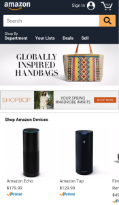
You can see this technique in action on the Amazon.com homepage. The first element users see is the navigation bar. There’s then one product featured — Amazon’s own Kindle — and a selection of top-selling products on the lower half of the homepage.
Split long menus onto a separate page
Can you imagine browsing Amazon’s huge range of product categories from a drop-down menu system? With millions of products and hundreds of categories and subcategories to browse, the menu would quickly become a unnavigable mess.
If your m-commerce store sells a large range of products in different categories, separating your menu only a separate page is a great way to improve usability and make it easier for customers to find the products they’re searching for.
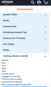
Above, we’ve included another example from Amazon. Instead of using a traditional drop down menu (or worse yet, a hamburger menu) Amazon lets users click through from the homepage to a dedicated menu page, from which it’s easy to navigate the entire website.
Keep it simple
One of the most common reasons mobile websites fail to produce results is that they’re hastily adapted from desktop in an effort to “be on mobile.” The end result is a website that performs a little bit better than a standard desktop website, but not that much better.
Since your users have limited space to view your m-commerce website, it’s important that you use space wisely. Features that might seem important on desktop become irritating distractions on mobile, taking space away from features and design elements that are far more important.
When you’re designing for mobile, keep it simple. Strip your page down to the bare essentials and give them as much real estate as possible. You can see this strategy in action on Target’s mobile website, which is designed to be as simple as possible for a great user experience.
Avoid small, hard-to-touch elements
On a desktop or notebook computer, users have a precise navigational device in the form of a mouse. On mobile, they have their fingers and thumbs, all of which are far less precise and far more prone to misclicks.
When your user interface is built around small on-page elements like text links and tiny icons, it becomes a serious challenge for users to click accurately. Add a small mobile screen and many of your users will have just as many misclicks as they do accurate ones.
As a general rule, you should avoid using small, hard-to-touch elements in your mobile website interface. While they may save space, they also confuse and annoy users, reducing their level of patience in your mobile app and — all too often — leading them towards competitors.
If you must use small design elements, keep them spaced relatively far from each other, making it easier for users to click where they want to instead of on an unrelated text link or button.
Improve your UI and UX to drive sales with MyCrowd
User experience problems can have a measurable negative impact on your mobile sales. Our online crowdtesting platform lets you carry out UX tests online to discover your mobile website’s weak points and make improvements that drive sales and increase revenue


