Is your mobile app ready for a redesign? Mobile app design and usability changes rapidly, with many of 2013 and 2014’s top trends already thoroughly out of date in 2016.
Below, we’ve listed five of the most significant mobile design and UX trends of this year to help you improve usability, adjust to new device dimensions and bring your mobile application’s UX and design into 2016.
Bigger Mobile Screens
For the first time since the 1980s, mobile phones are getting bigger. Many of today’s top-selling phones have screen dimensions of up to 6.9 inches, giving user interface designers much more space for content and navigational elements.
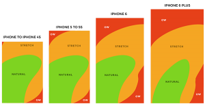
Bigger screens also create an additional problem: keeping UX elements in a comfortable range for users. The image below, courtesy of DesignModo, shows the comfortable reach of a phone user on different devices released from 2007 until last year.
As screens grow larger, accessing the extreme top and right side of the screen becomes much more of a challenge, requiring a different approach to UX design that prioritizes the more easily available space in the center and lower left of the screen.
Long Scrolling
Until recently, UX designers split their visual real estate into two categories:
- Prime above the fold space, which is where the most important components of a website or mobile app’s design should be
- Less valuable below the fold space, which is where the non-essential content and components belong
Since most mobile devices have long, thin screens that encourage downward scrolling, the old strategy of “essential above the fold, non-essential below” isn’t necessarily the best way for you to design your app in 2016.
Users have grown accustomed to scrolling down a page, particularly thanks to content-heavy websites like Tumblr and Medium. If your app is built around content, a layout that encourages users to continue scrolling can improve engagement and help to keep users interested.
Multi-Step Registration Forms
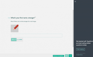
Tools like Facebook Login have done a great deal to simplify signing up for new apps, but there are many cases where it’s still necessary to fill in a complete registration form. Multi-step forms, which split signing up into several stages, make the registration process much more engaging.
Typeform, which lets developers create multi-step forms like the one pictured above, splits the typical long signup form into several different sections. Since users can focus on one step at a time, there’s no confusion or cluttered layout caused by the small mobile device screen.
There are also fewer distractions, with just one step for users to focus on and complete. These engaging, intuitive forms have grown significant more popular over the past two years and are now easy to spot on websites and in a wide range of mobile applications.
The “Hamburger” Menu
This love/hate design trend started as an efficient way to hide a website’s side navigation menu and was usually limited to responsive websites. Today, “hamburger” menus are popping up not just on desktop websites, but also in mobile apps with limited screen real estate.
Unlike the other design trends we’ve listed (most of which are positive developments), this one isn’t such a winner. Usability experts and designers both agree that hamburger-style menus are not good for usability, and A/B test data shows that a simple “menu” button performs better
Do you need to kill the hamburger button, like TechCrunch and Apple want you to? Maybe not, but it might be worth running an A/B test to see if people prefer a simple “menu” button to your app’s hamburger-style menu icon.
Card Content Layouts
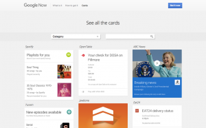
Ever since Pinterest launched in 2010, card-based layouts, which group items into “cards” on a large grid, have become more popular. Card layouts are often used for mobile and tablet apps, as a square card is far easier for users to tap accurately than a small, more precise text link.
Card layouts also make it easier to group information in the busy environment of a News Feed or stream of tweets. As TheNextWeb has documented, card layouts have grown more popular as responsive design has become more widely practiced.
If your mobile app is built around news or user-generated content, a card layout is a great way to improve usability and make navigating to relevant content as easy as possible for your users.
Test your app’s usability with MyCrowd QA
Our on-demand testing platform makes it easy for you to get helpful data on your mobile app’s design and usability. Try MyCrowd QA today to find and fix design, usability and quality assurance issues that are holding back your mobile app.


