MyCrowd Studio is an on-demand crowdtesting platform for websites and mobile apps. Kick tests off in real-time, get results remarkably fast.
MyCrowd Studio Supports the Following Test Types for both websites and mobile apps:
- Functional Testing
- Explorative Testing
- Ad Hoc Testing
- User Testing
- Accessibility Testing
- UX/ UI Testing
- Cross Browser Testing
- Compatibility Testing
- Usability Testing
- Manual Testing
- Website Testing
- Mobile App Testing
- Black Box Testing
- Test Cases run by the crowd
- Regression Testing
Expand your current testing capabilities. Speed up testing, improve device coverage and get to market faster.
Explorative Bug Hunts
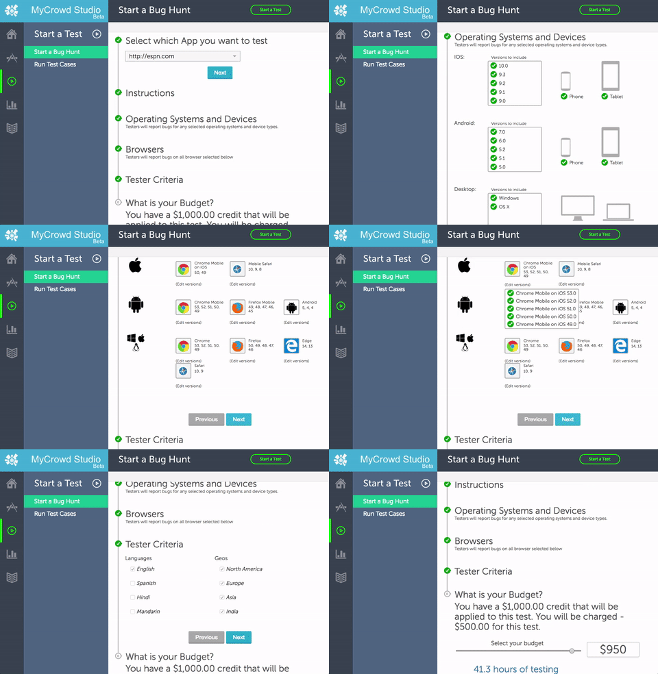
MyCrowd Studio makes it easy to setup explorative tests for website or mobile apps. Supply instructions, select your target devices, set your budget and launch the test. Whether self-service or fully managed, explorative bug hunts run on MyCrowd Studio can get you results within hours.Key Features:
- Run tests on website, mobile web and native apps (iOS, Android)
- In-the-wild tests on real devices.
- Get results within hours.

Test Cases run by the crowd
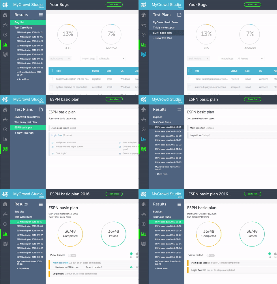
Perform Regression testing, compatibility testing or UAT with Test Cases. Easily create natural language Test Cases and let MyCrowd’s community of testers run through them quickly and cost-effectively.Key Features:
- Write test cases in natural language.
- Fast to setup, easy to maintain.
- Target exact devices or browsers.

Want to see MyCrowd Studio in Action?

Looking for High Quality Software QA Outsourcing Services?
Your organization can enjoy the benefits of a full QA department without the associated setup cost and hassle.Looking for a more flexible, short-term testing solution?
Try our self-serve, pay-as-you-go service: QAOnDemand, Powered by QASource.Only crowdtesting can offer you…
Half and Half
(Bug Hunt + Test Cases)
- 24 hours of exploratory testing
- 10 different devices
- 100 Test cases
The Express
(A week’s worth of testing in 3 hours.)
- 40 hours of testing
- 3 hour delivery window
- Exploratory and Test Cases
Over the Weekend
(start Friday, results on Monday)
- Launch a test Friday and have results Monday.
- You pick the devices
- Exploratory and Test Cases
Around the Globe
(Multi-language test)
- The name says it all. Perform foreign language tests in the US or in another country.
The Drill-down
(One device or browser deep dive)
- Target top devices/ browsers and perform a deep-dive test, exercising all the paths, features and functions of your software.
Compatibility Check
(Up to 10 devices)
- Push your app to its limit of compatibility. Use our network of 50k+ devices to ensure your app is locked down.
Why Crowdtest?
1. It’s fast.
Faster than you ever thought possible. Our testers can scale up and test in parallel. Want an example? With our “Express Test” – we can perform a week’s worth of testing in 3 hours. That means you get results the same day and can get your team of your developers back to developing. Faster testing means getting to market faster.2. Test in-the-wild.
Nothing beats the real thing for finding bugs before your customers do. Our community has a huge variety of devices and browsers and our testers are throughout the US and the world. This means lots of different devices and network conditions.3. Location matters.
Is your user base global? Our community of testers are too. We can target a specific geography as small as a zip code or as broad as a continent. Whether testing domestic of internationally, our global community of testers can provide you will stellar results.0%
Avg. Customer Savings
MyCrowd customer’s save 50%-70% annually through crowdtesting
Why MyCrowd?
4. Cost effective.
Our model is built to be efficient. Test leads, project managers and bug reviews are all built into our cost. This means you can cut your testing costs by 75% over hiring in-house and save 50% over hiring and managing offshore resources.5. Perform validation and regression testing.
Create Test Cases & Test Scripts and our crowd will run them on whatever devices you specify. Save time and money with easy to create and easy to maintain natural language test cases.6. Cover the gap.
Automation is great, but 100% coverage just never happens. Let MyCrowd’s half-and-half test perform a bug hunt + test cases.Learn how to setup a test in less than 30 minutes with MyCrowd Studio

Want to expand your testing capabilities?
You now have the world’s largest QA team. MyCrowd is a community of high quality professional testers, vetted for excellence. Our platform controls the crowd, delivering superb results every time. Leverage MyCrowd Studio to run smoke tests, run manual test cases or perform explorative tests on-demand. Unlock the QA bottleneck.
Test your app on every device:
Real in-the-wild testing, with real testers and real devices. Nothing beats the real thing when you need your product to be bug free. Our testers have more than 50k different devices and browsers.Stop losing customers to buggy websites and mobile apps
We are Expert Crowdtesters
Crowdtesting is a revolutionary way to perform QA testing. It provides a flexible, global and diverse testing at a speed never before thought possible. Cut your costs in half with crowdtesting in a fraction of the time.Learn more about MyCrowd with our video…
Delight your customers with a Bug Free product.
What our Customers say:
“We’ve been using mycrowd for a while now and we’re absolutely amazed with the results we get. The reported bug reports are precise and easy to reproduce. The built-in crowd-based quality management is fantastic. Moreover, the crowd-based approach to QA is a refreshing and effective method to overcome internal tunnel blindness in quality management.”
Florian Dorfbauer
“QA has been a problem at every company I’ve worked. MyCrowd is the solution for that. It lets us ramp up QA when we need it and it provides a sense of real user testing that standard QA often misses.”
Gal Josefsberg
“MyCrowd QA will find your blind-spots. Scripted QA can only cover so much, but real users find real bugs. MyCrowd lets you economically ramp up real users, for both exploratory testing and scripted testing- vastly improving your coverage.”
Geoffrey Smalling
“MyCrowd has been a huge addition to our QA process. We now find bugs and issues faster and have unlimited flexibility in scaling testing up or down based on the projects we work on. This tool is a must have for any web developer or agency.”
Brandon Ernst
“As a digital agency specializing in responsive mobile web applications our customers expect everything to work perfectly on every device. MyCrowd QA solved the headache by providing an on-demand test crowd with coverage across desktop, iOS and Android devices… with same day results!”
Keyvan Hajiani


